Heatmap viewUpdated 4 days ago
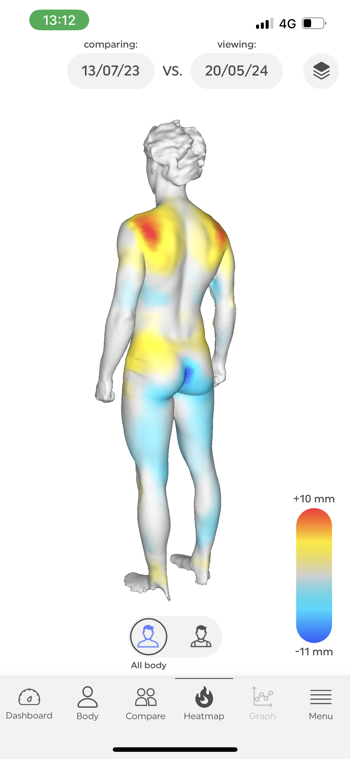
The Heatmap is a very straightforward way of visualizing how your body has changed over time. Our app overlays the two scans you wish to compare, and it color codes the change in volume over time:
- Blue colors indicate a decrease in volume over time.
- Yellow and Red colors indicate an increase in volume over time.
- Grey areas have not witnessed any significant change.
- *The darker the color, the greater the change
TIPS: You can select which scans you’d like to compare by tapping on the dates for each scan. Make sure to replicate the same posture between scans - this will help ensure that the scans can be overlayed.